Out-of-home (OOH) advertising has an undeniable impact—but designing for it isn’t always straightforward. Should you use motion or static? How much text is too much? Where should the logo go? As creative strategists who have optimized thousands of OOH campaigns, our Creative Studio team gets these questions all the time. That’s why we’re breaking down the answers and sharing practical tips to help your creatives grab attention and perform in the real world.
What makes an out-of-home ad impactful?
Keep it simple. Viewers only have a few seconds to absorb your message, so clarity always beats complexity. Find ways to say more with less.
The most impactful out-of-home creatives combine clarity, motion and relevance. Motion captures attention, bold visuals communicate your core message instantly and data-driven elements—like weather or location triggers—make your ads feel timely and personalized.
What are the best colors for out-of-home placements?

Context matters—literally. Your out-of-home ads live in the real world, surrounded by busy environments, changing light and competing visuals. Navigating that can be tricky.
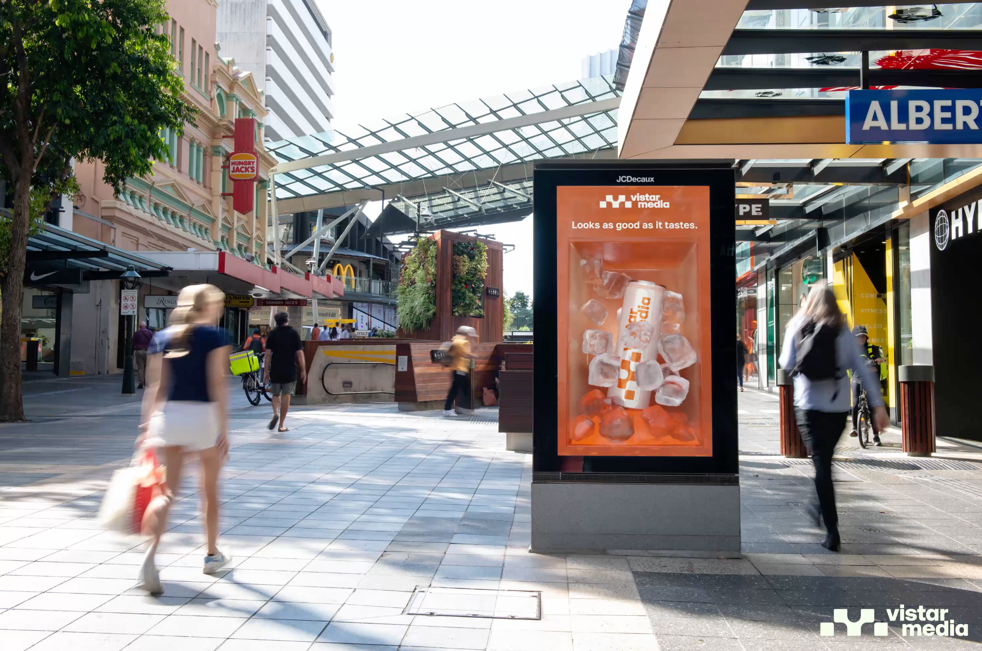
High-contrast, bold colors capture attention fastest. Bright reds, oranges and yellows pop against neutral backdrops, while complementary contrasts (like blue and orange) make elements stand out. Just remember: colors can shift depending on lighting and surroundings, so always test your palette in context. And above all, stay true to your brand’s identity.
Where should I place my logo?
Logo placement isn’t one-size-fits-all—it depends on the screen and environment. On vertical, low-to-the-ground screens like urban panels or bus shelters, the top of the creative often gives your logo the most visibility. On larger, eye-level screens, the bottom can work just as well. Always check how your logo reads depending on size, position and screen location. They all matter to make sure your brand sticks.
How much text should I include in my OOH ad?
Out-of-home audiences are usually on the move, so less is always more. Two to three powerful words are often enough to deliver your main message. Use large, bold headlines to capture attention first, and let smaller supporting copy add context without competing for the eye. Above all, prioritize clarity and readability over cleverness—your message needs to be understood in seconds.
Are QR codes worth it?

Yes—when used in the right setting. QR codes shine in environments with longer dwell times, like transit hubs or waiting areas, where people have a moment to engage. Pair them with clear instructions so viewers know exactly what they’ll get.
In fast-paced or visually busy locations—like taxi tops or crowded venues—QR codes are less effective, since people often pass by too quickly. The key is matching the QR code to the right environment that works for your audience. If the dwell time is typically too low where you're running, don’t waste precious design space on it.
What’s the difference between dynamic and animated ads?
Though “dynamic” and “animated” sound similar, they are very different in the world of DOOH.
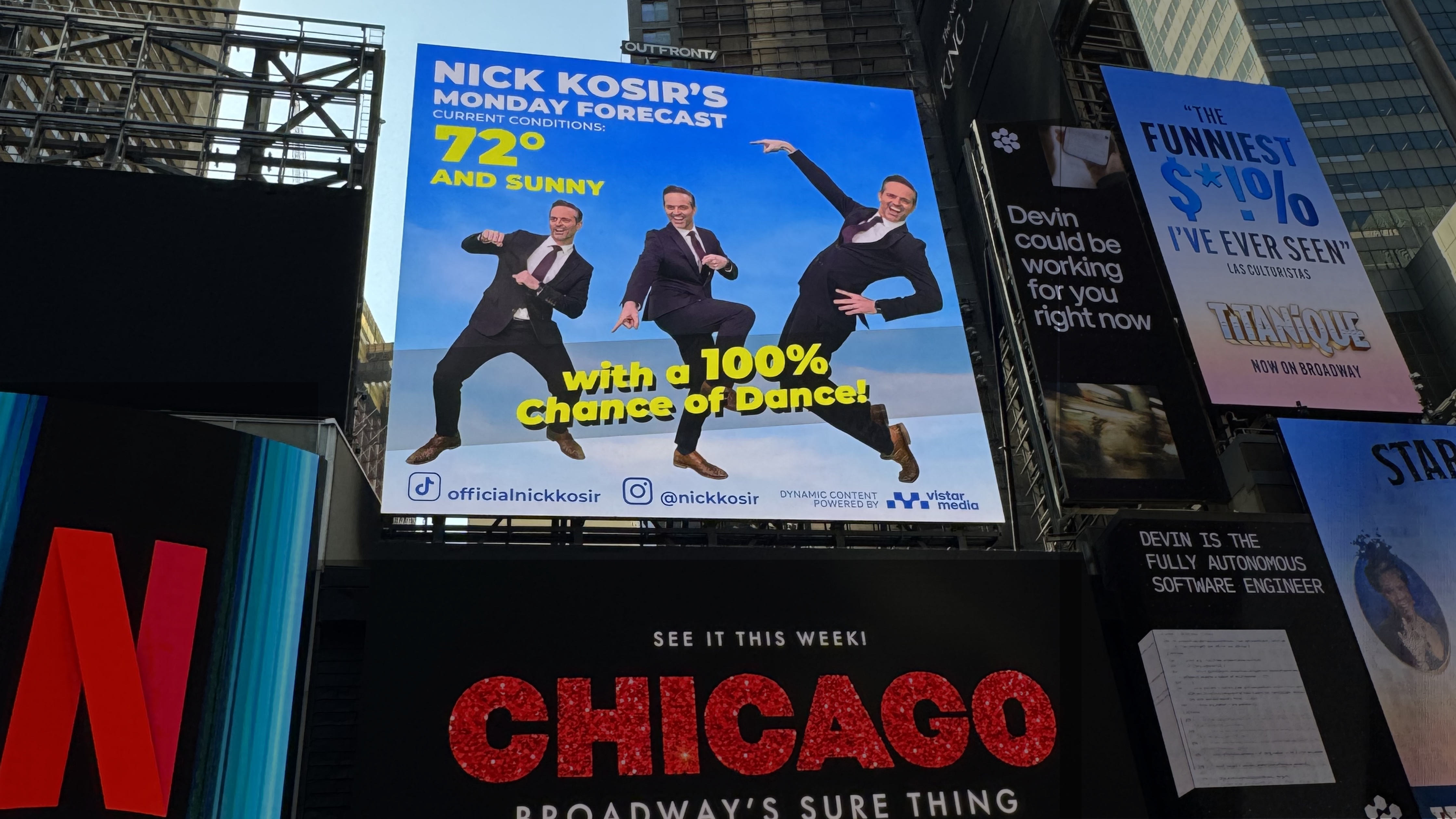
Animated ads use motion to capture attention or showcase more of your brand and products. These are typically .MP4 or .MOV files that bring life to your creative through movement. More on motion graphics in question eight!
Dynamic ads, on the other hand, are powered by data. They allow elements of your creative to update in real time—without any extra work from your design or marketing team. For example, a retailer promoting Black Friday deals would normally need to redesign and redeliver each ad manually as promotions change. However, with a dynamic creative, the latest promotions automatically populate across all sizes and locations.
In short:
- Animated ads: Grab attention and showcase your brand.
- Dynamic ads: Personalize campaigns at scale while saving hours of manual updates.

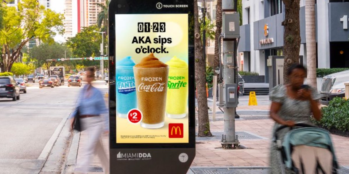
What kind of data can I use to make my ad more relevant?
Data can bring your ads to life, making them feel more timely, personalized and impossible to ignore. Think: coffee in the morning, rain gear during a downpour or event promotions at entertainment venues. The key is planning for data-driven variations from the start so every version feels intentional and on-brand.
How to use data to boost your creative:
- Time of day: Morning vs. evening messaging
- Weather & health conditions: Rain, sun, snow, allergies, etc.
- Location: Proximity to stores or points of interest
- Day of the week: Weekend vs. weekday messaging
- Live events: Sports scores, concerts, local happenings
- Sale updates: Highlight available products in real time
Is a static or motion creative the best option for my campaign?
Our brains are hardwired to notice movement, which makes motion one of the most powerful capabilities in DOOH advertising. Even subtle animations—a shifting background, a product sliding into view or a gently looping motion—can capture attention and drive engagement without overwhelming the design. That said, video isn’t always the answer. Static images still shine when simplicity matters, or when your message needs to be instantly recognizable. They’re perfect for quick-hitting messages or locations with brief dwell times. Plus, not every placement supports video. Having static creatives ensures your campaign reaches its full potential.
The key? Mix it up. A diverse set of creative formats lets your DOOH campaigns grab attention, communicate clearly and reach audiences wherever they are.
Are animated 3D creatives supported on all DOOH screens?
Any screen that supports motion files can bring 3D creatives to life. 3D adds depth and realism, making your message truly stand out—but don’t overdo it. Complex effects can steal focus from your core message, so make it pop while keeping attention where it counts.
Follow-up question ✋
How do I know which screens support motion? The media owner can tell you, or if you’re using a platform like Vistar Media, you can see all creative sizes and capabilities straight from the media plan—ready to download and deploy.
What sizes and file types do I need to design my creatives in?
Unlike a social feed, out-of-home can come in all shapes and sizes. If you're working directly with media owners, be sure they provide the sizes for you. If you decide to activate programmatically through Vistar’s DSP, we’ve simplified things: four standard sizes are all you need and they’ll fit most digital screens in your campaign without stretching or distorting your design.
Sizes include:
- 1400x400
- 840x400
- 1920x1080
- 1080x1920
The type of file varies by network, but common formats include:
- Video/animated: .MOV or .MP4 (max file size: 50MB)
- Static images: .JPG (max file size: 10MB)
- Dynamic HTML5: HTML5, CSS, JavaScript
- Static color space: RGB and CMYK
Can I test my DOOH creative before the live date?
.gif?width=1200&height=600&name=Blog%20Creative%20FAQs%20(4).gif)
Yes! Many networks (including Vistar Media) offer preview tools or staging environments so you can see your creative exactly as it will appear in the wild. Testing the creatives helps you catch issues early and gives you the confidence that your ad will land the way you intended once it’s live.
Want to see your own ads mocked up or get access to the tool yourself?
How do I design for different screen sizes and orientations?
DOOH screens come in various sizes and orientations (portrait, landscape, square). To optimize:
- Design modular layouts: Keep key elements like headlines, logos and calls-to-action flexible so they can be repositioned.
- Prioritize hierarchy: Ensure the most important information is visible first, regardless of screen size.
- Test visibility: Preview designs on each orientation to make sure text remains legible and imagery impactful.
- Avoid clutter: Simpler designs adapt more easily across screens and maintain legibility in both small and large formats.
What are common mistakes to avoid in DOOH design?
- Too much text
- Small or unreadable fonts
- Ignoring motion or dynamic capabilities
- Overcomplicating visuals
- Poor contrast or color choices
- Neglecting placement and environment
- Not testing before launch

.jpg)